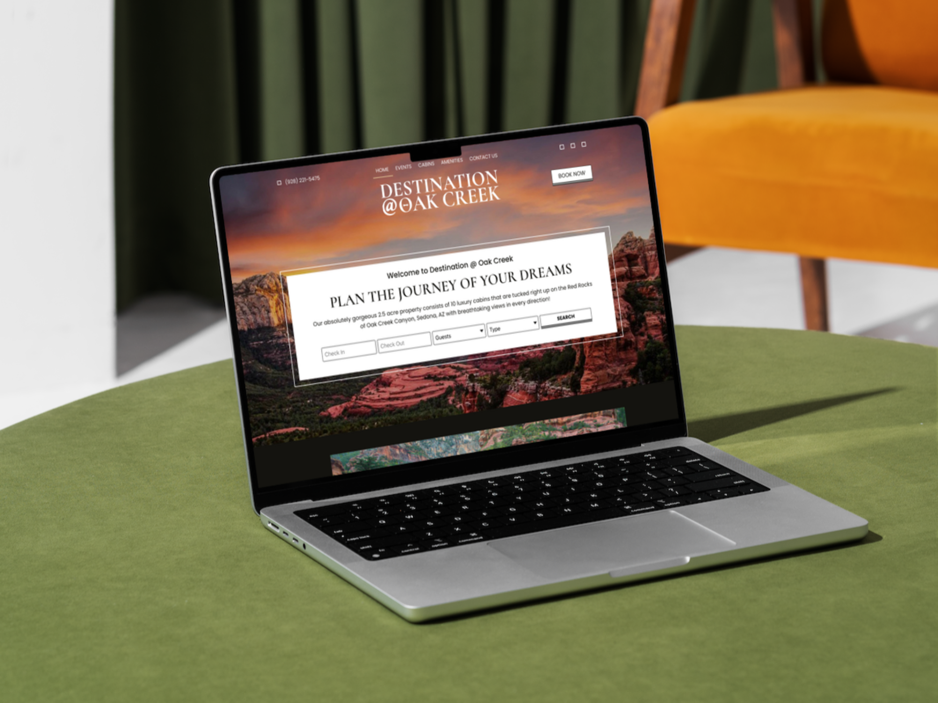
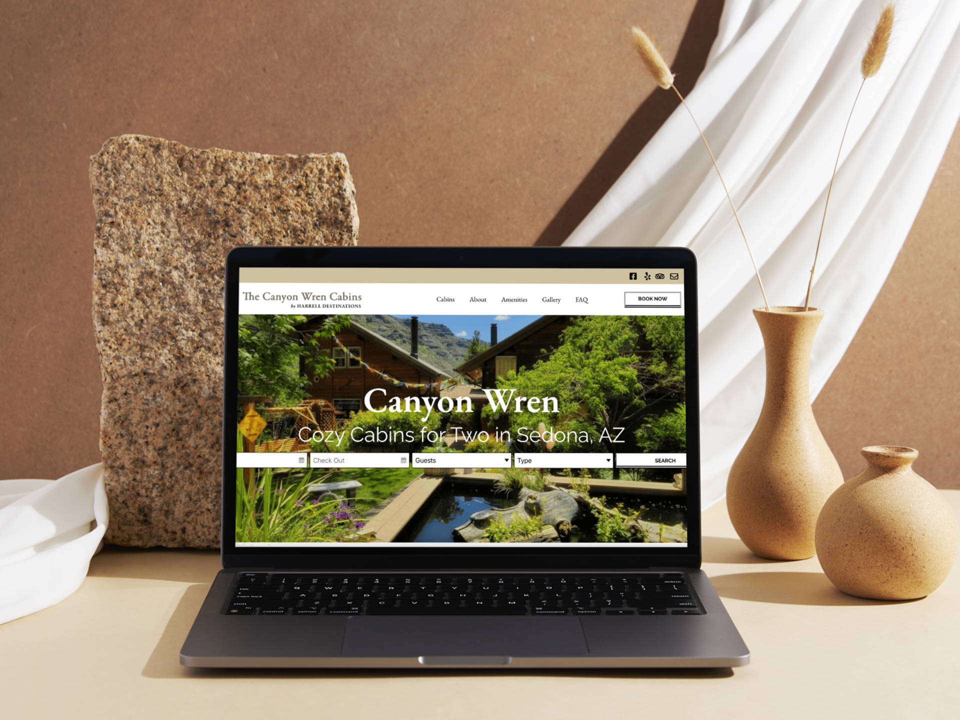
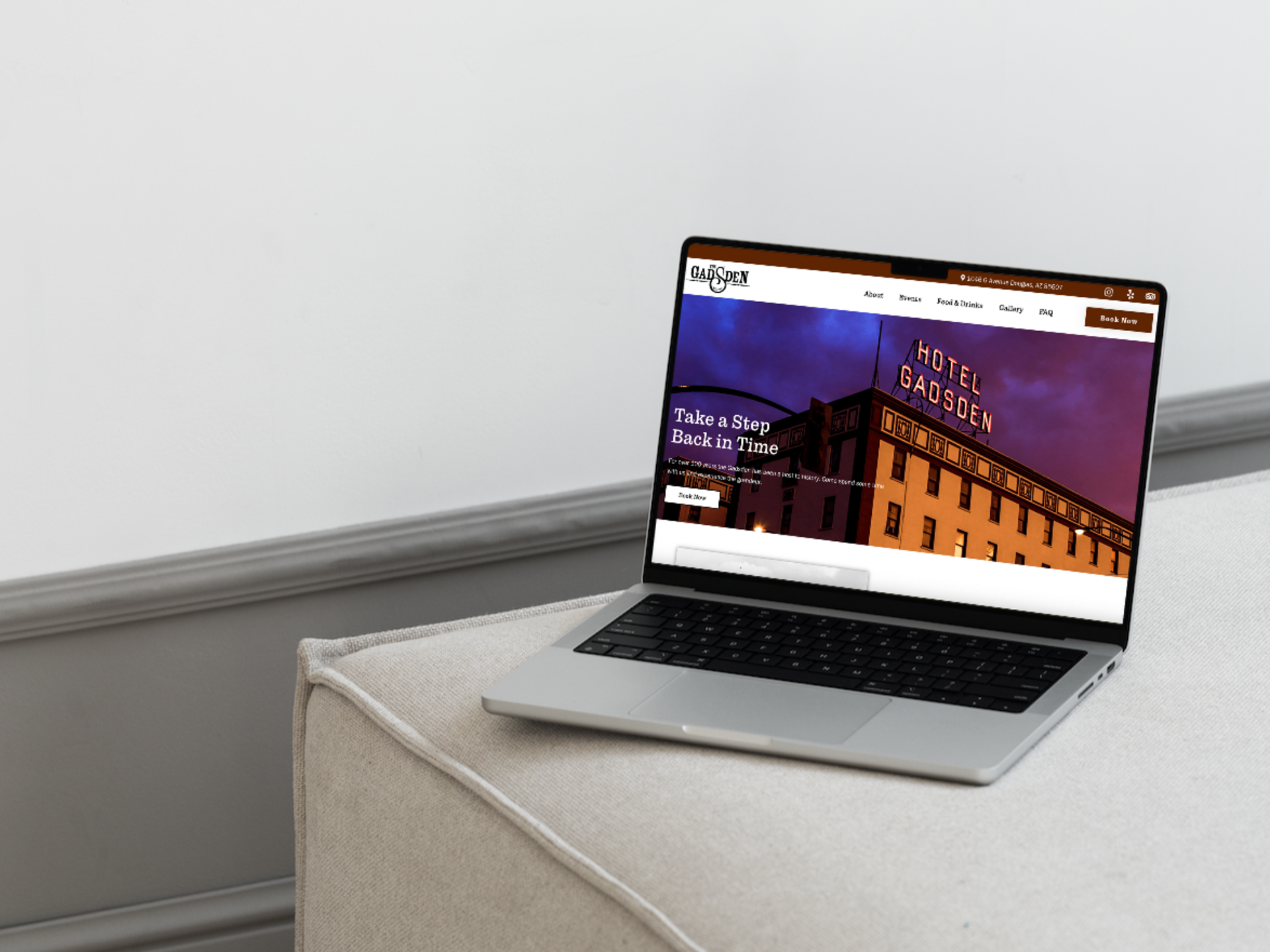
This project with Harrell Destinations focuses on the creation of three distinct booking websites for their travel company, each tailored to cater to different target audiences and travel experiences. Through meticulous research and user-centered design, I crafted intuitive and visually captivating websites that seamlessly guided users through the booking process, while also highlighting the unique offerings and destinations, ultimately enhancing the user experience and driving conversions for the travel company.
Website Design Case Study - Creating Three Unique Booking Websites for a Travel Company
Introduction:
This case study showcases my expertise in web design through the creation of three distinct booking websites for a travel company. The goal was to design visually captivating and user-friendly websites that would showcase each property's unique offerings, engage potential guests, and streamline the booking process. By employing a comprehensive web design process, I successfully delivered three responsive and impactful websites that enhanced the online presence and revenue generation capabilities of the travel company.
Client and Project Background:
The client, a prominent travel company specializing in luxury accommodations, sought to establish an online presence for each of their properties. They required three separate websites, each tailored to a specific location while maintaining brand consistency. The primary objective was to create engaging websites that would effectively drive bookings and provide a seamless user experience.
Design Process:
1. Discovery and Research:
I conducted thorough research to gain insights into the target audience, market trends, and competitors' websites. This process allowed me to identify unique selling points and key features for each property, enabling me to create tailored designs that resonated with potential guests.
2. Information Architecture and Wireframing:
To ensure intuitive navigation and a seamless user experience, I developed the information architecture for each website. Through wireframing, I mapped out the site structure, content organization, and user flow, ensuring a logical hierarchy and smooth user journey from exploration to booking.
3. Visual Design and Branding:
Drawing inspiration from the client's existing brand identity, I crafted visually striking designs that reflected the ambiance and character of each property. Using appropriate typography, color schemes, and imagery, I created cohesive visual identities that aligned with the travel company's brand while showcasing the unique attributes of each location.
4. Responsive Web Development:
I ensured that the websites were optimized for various devices, providing a seamless browsing experience across desktops, tablets, and mobile devices.
Results and Impact:
The implementation of the three property booking websites yielded significant results:
1. Increased Bookings: The visually captivating designs and streamlined booking process led to a notable increase in bookings for each property. Clear calls-to-action, seamless navigation, and a user-friendly interface motivated potential guests to convert into bookings.
2. Enhanced User Experience: The responsive design allowed users to access and book properties from any device, providing a consistent and enjoyable experience. The websites' optimized loading speeds and intuitive interfaces contributed to an enhanced user experience, leading to increased engagement and conversion rates.
3. Strong Brand Presence: The three unique websites strengthened the travel company's brand presence by showcasing the distinctive features and offerings of each property. Consistent branding elements across all websites maintained brand recognition and reinforced the company's reputation as a provider of luxury accommodations.
Conclusion:
The website design project for the travel company resulted in the successful creation of three visually captivating and user-friendly booking websites. Through comprehensive web design processes, I created engaging experiences that effectively showcased each property's unique attributes while driving bookings. This case study exemplifies my expertise in web design, highlighting my ability to create impactful websites tailored to specific business goals and target audiences.